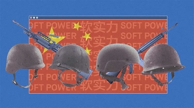
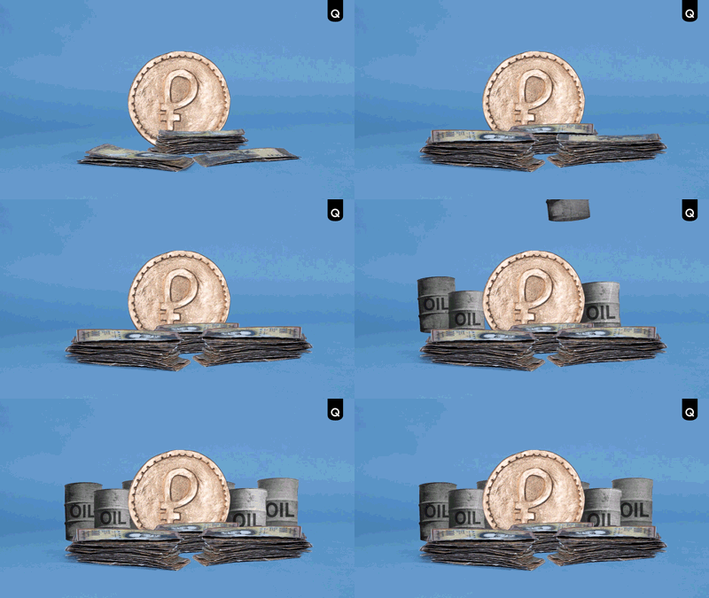
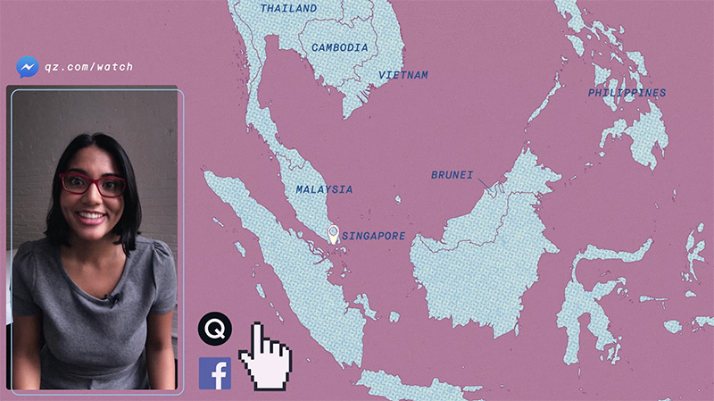
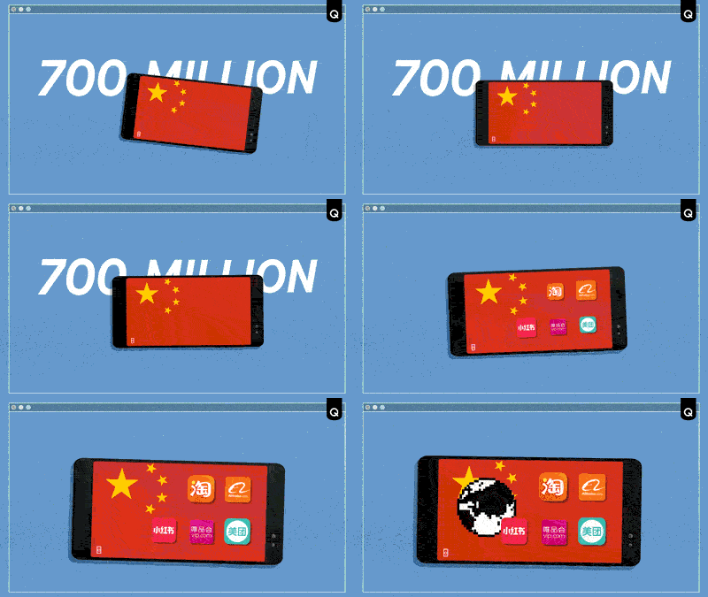
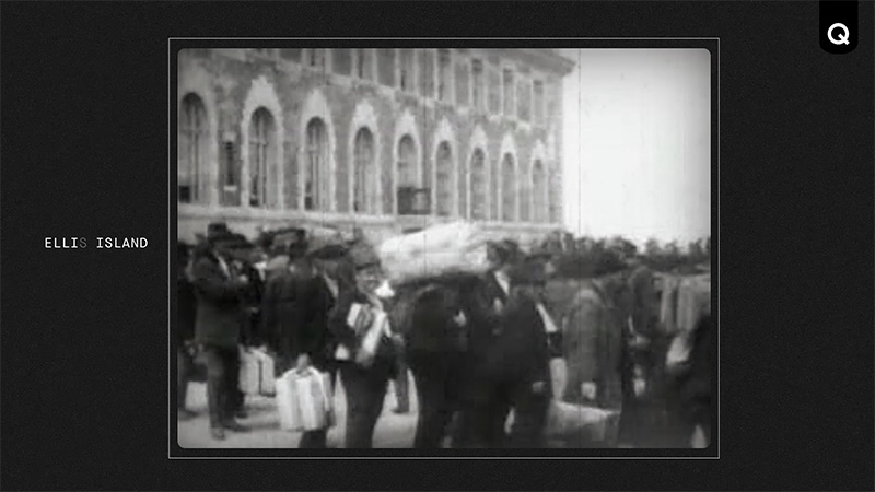
The Quartz video team started creating a weekly news show for Facebook Watch. Concept-wise, it mixes the style of newsy Youtube explainer videos, and international on the ground reporting with a slight economic twist. It feels very much like the essence of Quartz’ collective reporting style.
As the creative director of the series, I wanted the show to feel fun and fresh, but also have the gravitas of reporting you can trust. I was tasked with coming up with the “look” of the show and art directing it, as well as hiring a team of animators to help out.
INSPIRATION
My main inspiration for the show was 90s internet nostalgia. Pixelated cursor hands, locators and globes populate the show. For frames, I often used browser windows, and clicks, beeps and blinking cursors. Marcie LaCerte, another animator working on the show, is also into retro internet and heavy textures, as well as stop motion. I was able to take inspiration from her style, combine in with mine, and create a product unlike any other news show.
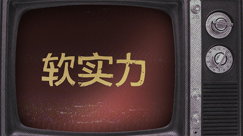
I used several noise backgrounds that imitate the analog look of old TV noise, and a shifting halftone texture as another element of nostalgia. As for colors, I worked within the blue/pink Quartz palette.
We needed a style that could be quickly be replicated in order to meet the grueling weekly schedule. Because of the demands of international reporting and pre-production, animation often happened in 2 days. So I set up a library of textures and elements that could easily be dropped in whenever they’re needed.
The team also used a lot of archival images for time’s sake, and to add an extra element of texture and nostalgia. The show looks like a heavily textured digital collage, and has a lot of whimsical elements. I was very happy with the end result and how several different animators were able to fit their own artistic sensibilities into the style of the show.
To watch the episodes, click here. If you need an episode recommendation, I’d go with China’s Soft Power in Kenya.


