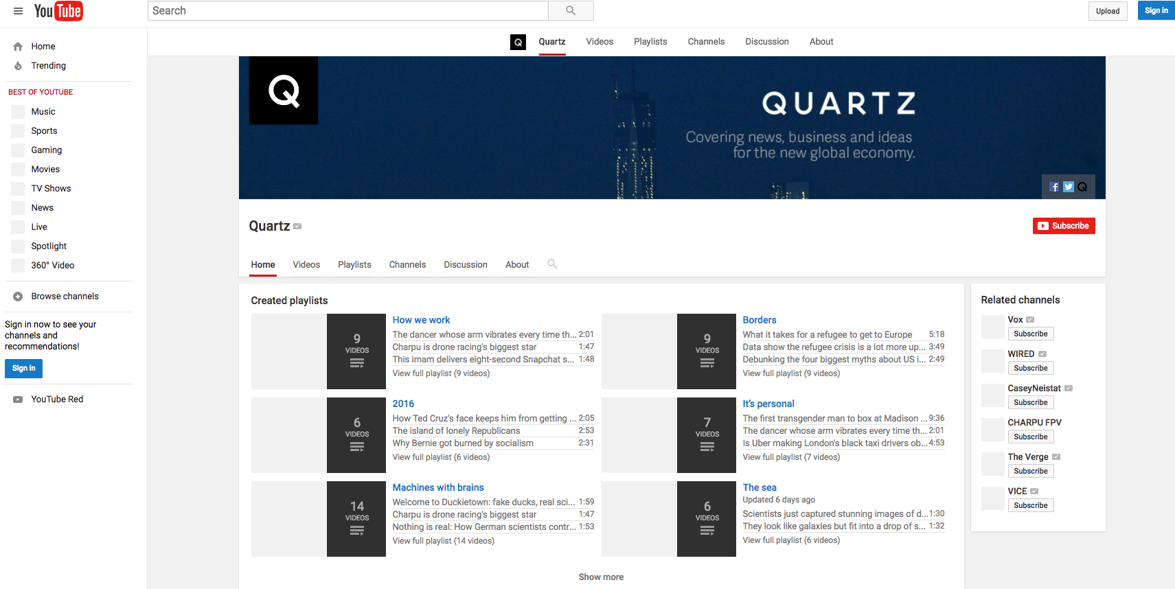
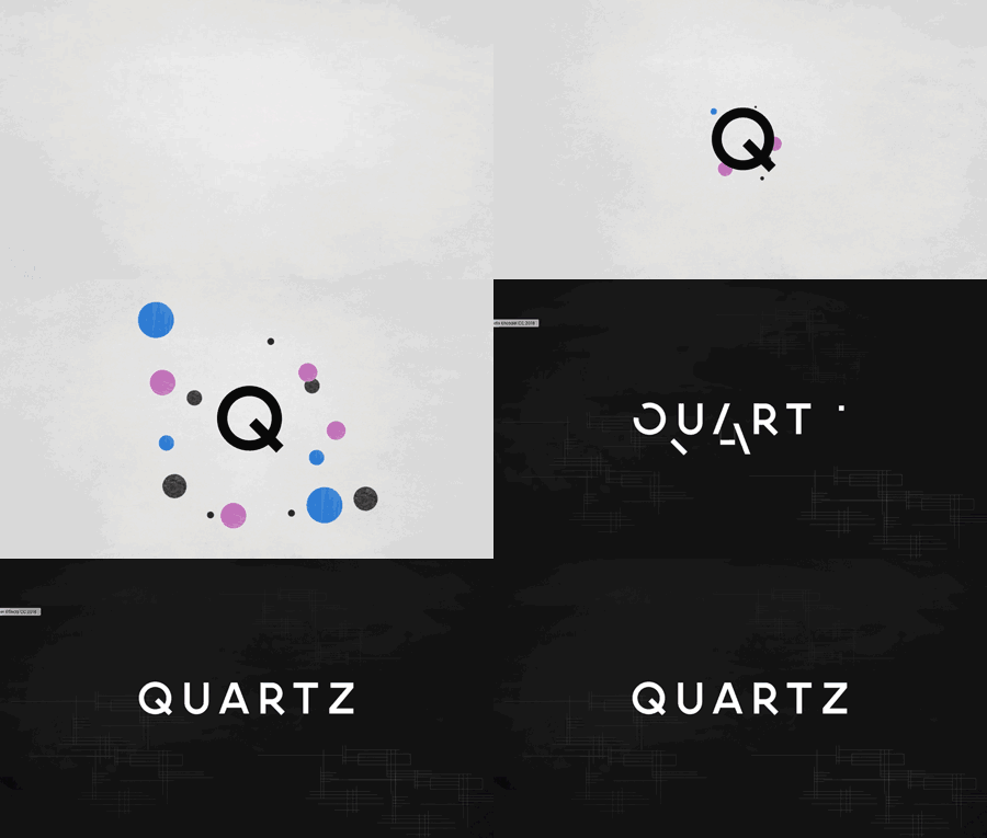
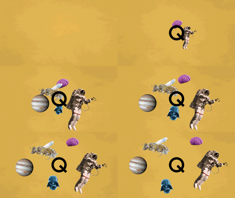
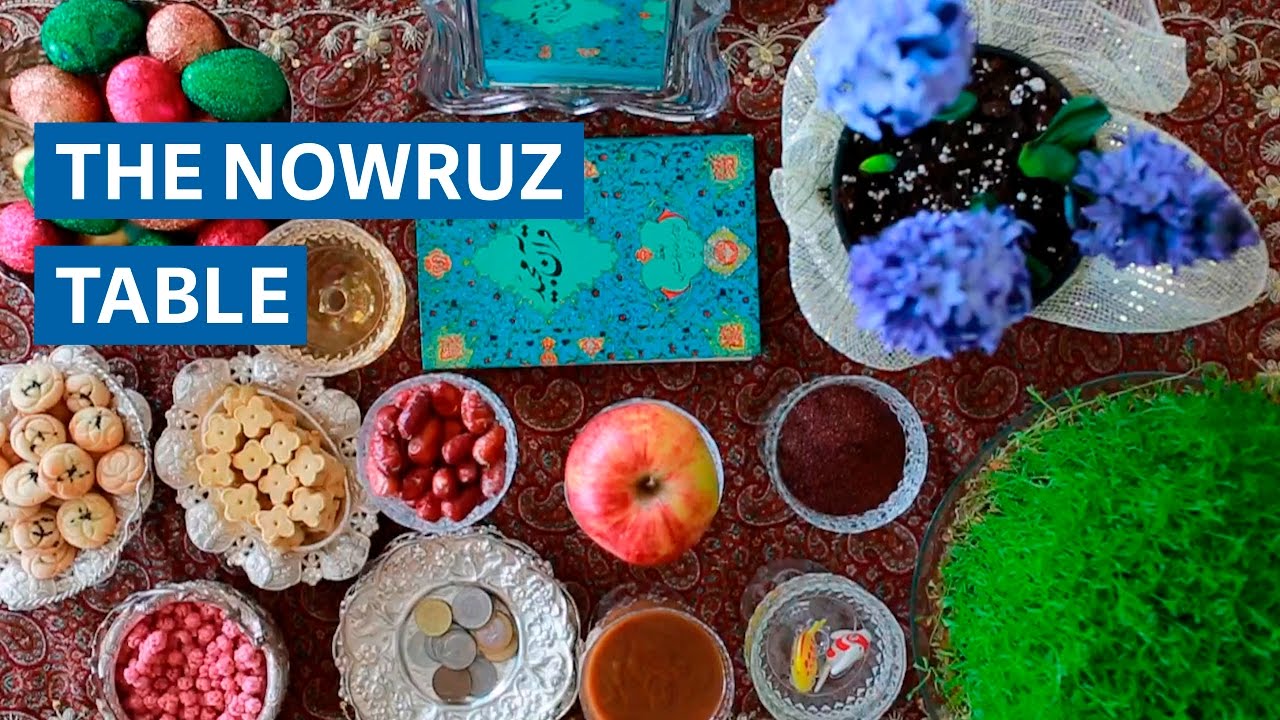
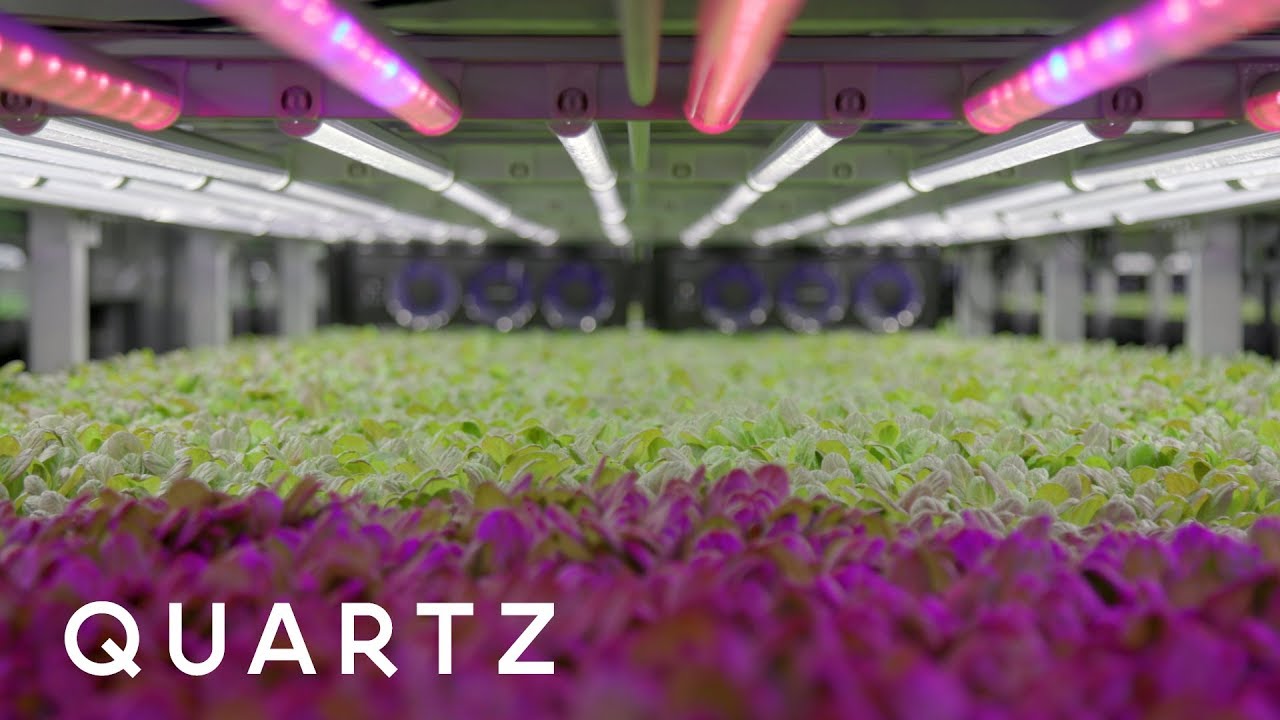
When I started at Quartz, I was charged with making our brand more recognizable, and transitioning us from being facebook-centric to Youtube first. To do that, I made new graphics for our YT page, and created a branded bumper that could be customized for our different video series. From there I did market research for what UI works best for maximizing subscriptions and created credits that reflected the results of my research but also increased brand recognition. Between the design changes, Quartz’ new video series and the changes that I implemented in metadata, description and titles, our subscriptions have grown by over 500%.
Banner:
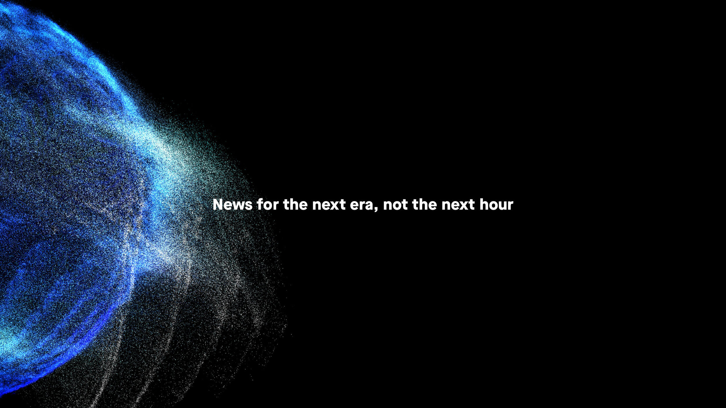
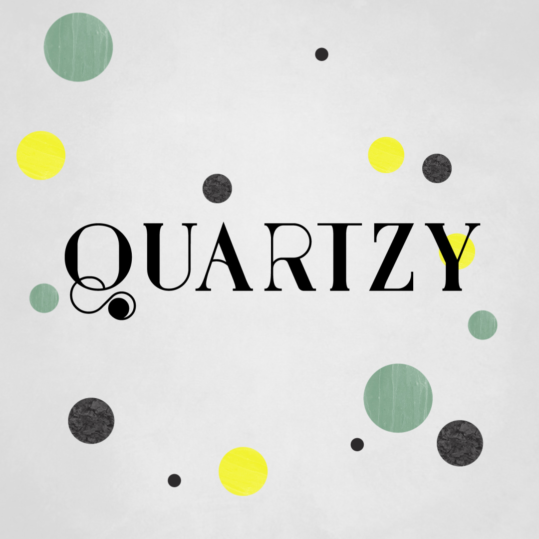
The redesign needed to reflect our global brand and our breadth of news coverage. I switched the image to the abstract particle ball and void in order to keep our banner in line with both Quartz’ Facebook and Twitter visuals. Youtube uses one image for all desktop, mobile and TV views, so the rebrand had to look good in all of these different views and on all devices.
Credits and Bumper:
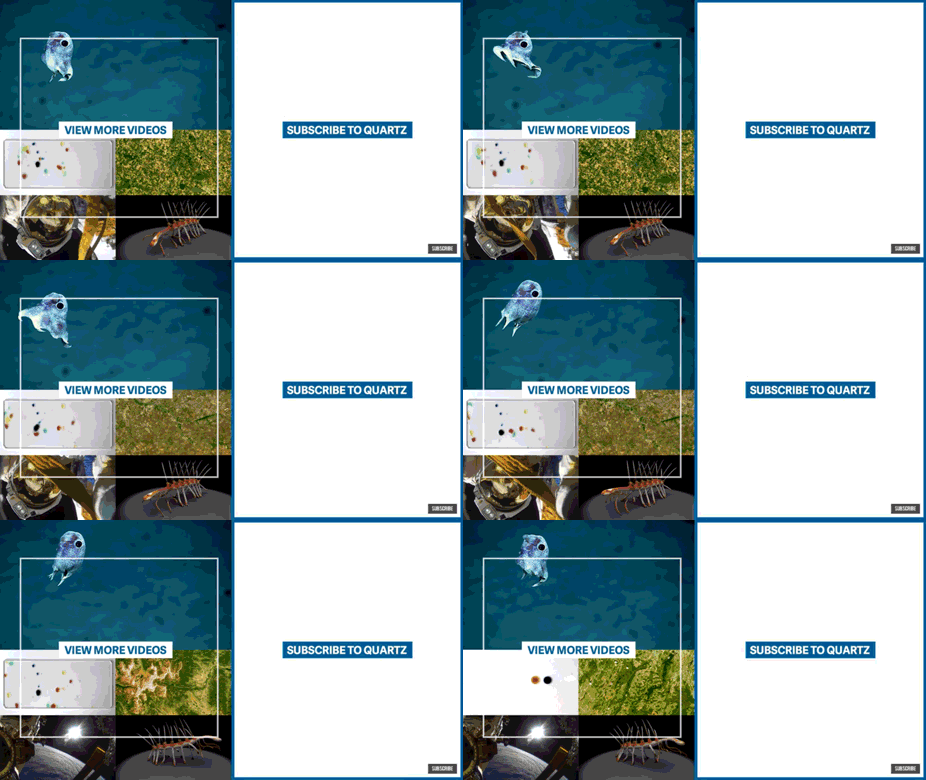
The original bumper (pictured on the left) video snippets are very long, very large mov files. They increased the template size by gigabytes which made it difficult to get updates to remote members of our team. The view more videos and subscribe buttons were also seeing very little interaction, since most people don’t wait until after the credits to interact with those buttons.
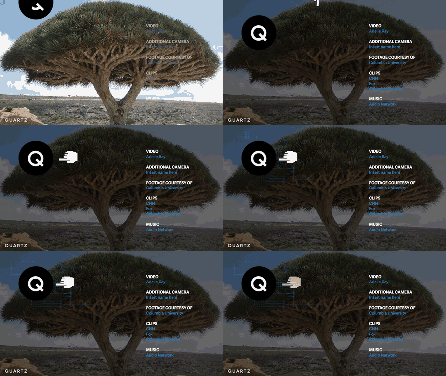
My job was to increase user interaction with our subscribe and video elements as well as brand awareness while simultaneously making it easier for team members to add these credits to their videos.
The solution I came up with was to create a built in subscribe button (the Q) that serves as a map of where to add the animated element on top after adding it to YT. I also added the credits in simultaneously to decrease the chances of our audience leaving before the interactive buttons appear. The hand helps bring attention to the subscribe button. This has increased the interaction with our YT interactive buttons over 200%. The last gif represents an annotated version that I made for the team in order to incorporate post-script video.
I created a new bumper that was much smaller in file size. That made transfers to remote members of the team much easier and our overall template size smaller. The bumper was made to match the rest of the Youtube design and increase brand awareness, but also be iterated on so it could be customized for different video series. The first bumper in the series is our standard bumper.
Thumbnails:
To cement the redesign, I updated our thumbnails. The goal was to maximize brand recognition rather than emphasize the title of the piece, but also not ruin the integrity of the images.
