PITCH DECK
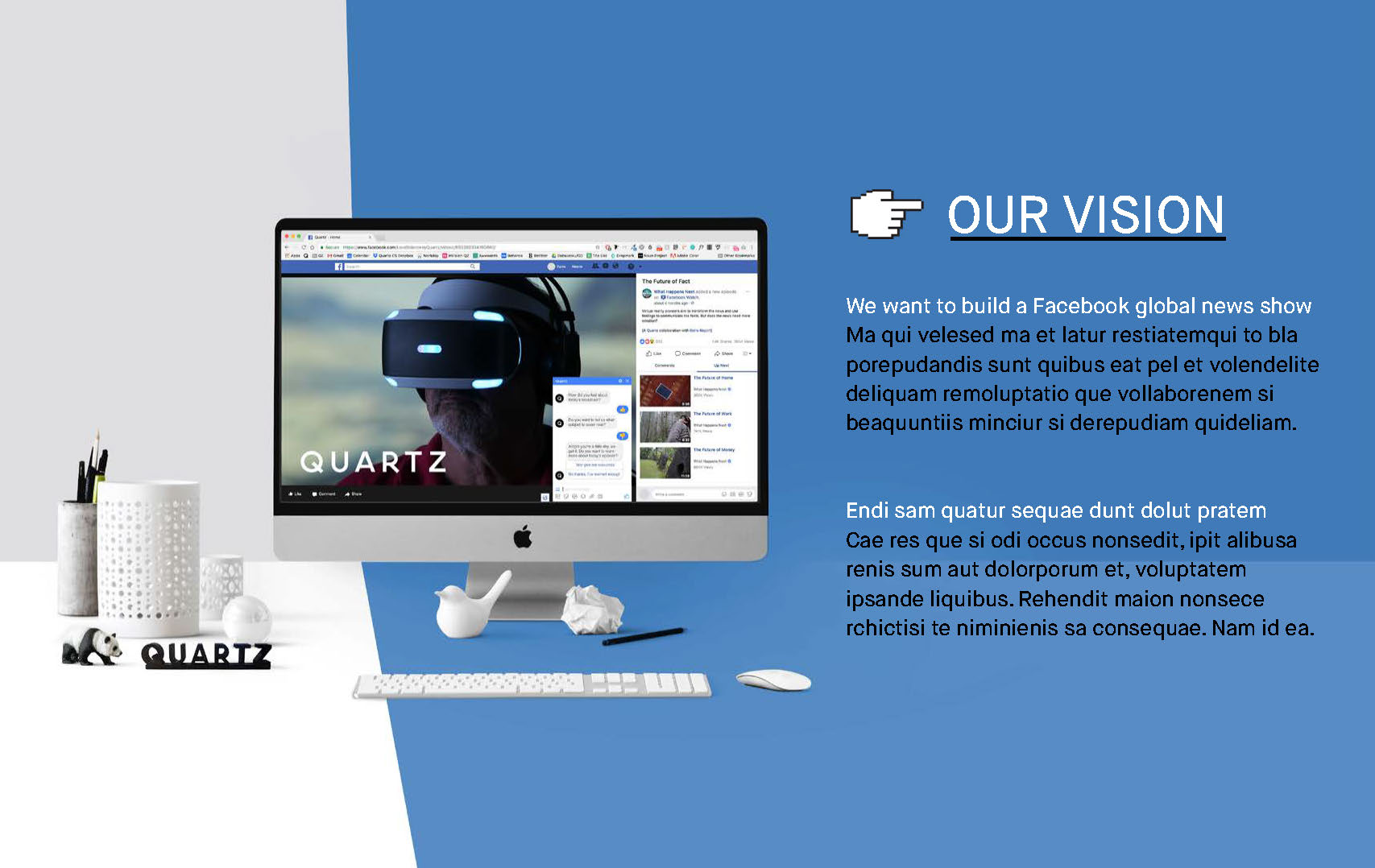
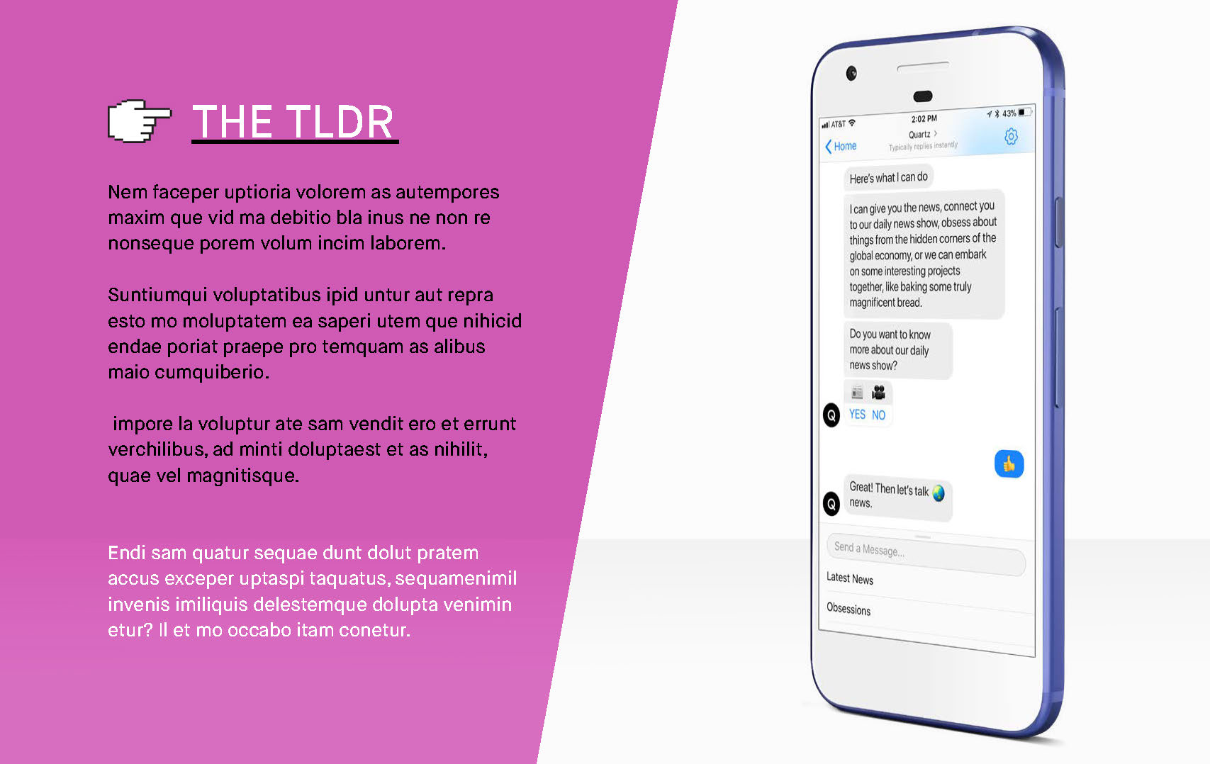
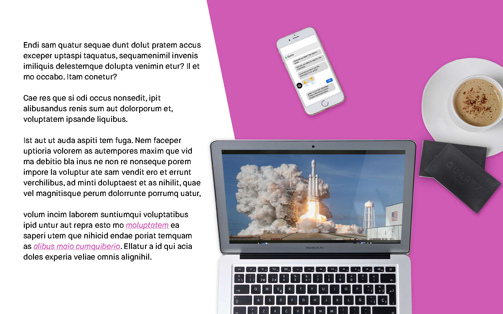
Quartz is launching a Facebook news show in July and I am serving as its art director. Here are some selected pages from the pitch deck that I designed. It provides a preview of the overall art direction of the series. It's bold and modern, but also has a sense of humor and a bit of quirkiness. The colors reflect Quartz' established palette and uses the more saturated colors. The intense blues and pinks will catch the eye of even the most apathetic Facebook scrollers.
PROPS
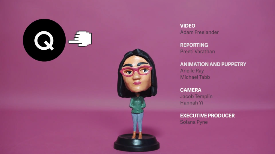
One of the more fun elements of the overall creative direction are the props. I thought that bobbleheads would be a nice, physical touch that would serve as a bridge between shot footage and graphics produced in post. They also add a bit of levity to the very serious subjects that Quartz will be tackling. My colleague Michael Tabb modeled them in Cinema 4D, then 3D-printed, sanded and painted them.
PILOT
This is the original concept, and while it could use some fine tuning, it captures the spirit of the show that Quartz will create. A more refined version is launching on July 19th.
